Building a banking design system
- 400+
- active elements
- ~500
- digital products on it
- 650+
- internal team contributors
- ~500K
- launch engagement
Evangelising design systems
My journey evangelising design systems started back in 2016, when I discovered the Atomic Design book by Brad Frost. It was completely new for me to understand how I could organise and link every element to each other, and make it more flexible to manage.
Then came Material Design, Nathan Curtis, Airbnb, GOV.UK and more.
I started watching and reading everything about building design systems with a specific methodology and tools.
After consuming so much content, I realised I needed to raise awareness in my design community.
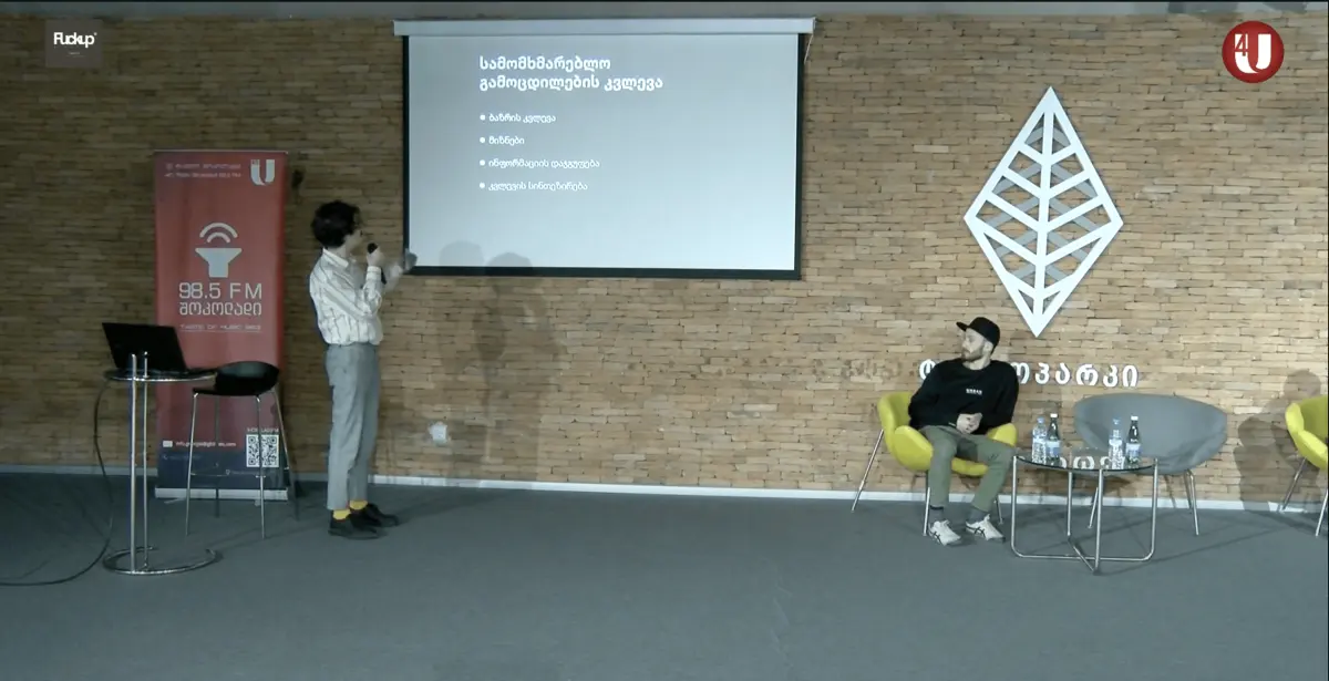
My friend Hayk Asriyants, who organises very cool events in Georgia, invited me to the very first Product Tank Tbilisi event, where I spoke about design systems and Atomic Design methodology. The concepts were completely new for the audience.
The opportunity at Bank of Georgia

Bank of Georgia is Georgia's second largest bank by total assets, serving more than two million customers, after TBC Bank. It is considered a systemically important bank by the National Bank of Georgia.
I joined as a Product Designer in December 2018. We were eight designers building products with cross-functional dev teams, but everyone was working in chaos. The problems were obvious:
- Inconsistent UX and interfaces across all products
- Design files that could not sync between teams
- Months-long designer onboarding
- Constant developer handoff clarifications
- No quality standards or review process
- Components recreated from scratch every time
- Brand guidelines not systematically applied
My role
I started on the sales and promo channels team, working on the initial bog.ge, and moved to Senior Product Designer in March 2019 and Product Design Chapter Lead in April 2020. Three years and three months at the bank in total.
I was one of the first team members who laid the foundation of design systems at Bank of Georgia, from advocacy to execution.
I helped found the excellence team with our Head of Design and drove adoption across the organisation. Later I became owner of the bog.design platform.
This became one of the first public banking design systems in Europe at that time.
Methodology and DesignOps
We didn't jump straight into building components. That's where most design systems fail at scale.
First we studied the organisational models for enterprise design systems. There are three approaches:
- Solitary
- Central (core)
- Federated
One person makes the system and everyone else receives it. Fast to start, and it stops the day that person is busy.
A dedicated team owns the system full time. Consistent, but the team becomes the bottleneck every product waits behind.
A central team holds the standard, and designers from the product teams contribute into it. Slower to agree, but it scales with the organisation instead of against it. This is what we chose.
Before choosing our federated model (a central excellence team supported by product designers) we had to advocate hard.
This was 2018. Design systems weren't mainstream. No banking best practices existed.
I remember our first design system meeting. Almost fifty people: dev teams, product teams, compliance, operations.
Everyone had opinions and critical questions.
“Why should we do this?”
“How will this affect our timelines?”
“Who's responsible for maintenance?”
The strategic approach
If you are starting to build a design system, or even a small style guide, these are the first things you would do:
- Audit existing components across all teams
- Create a shared governance model
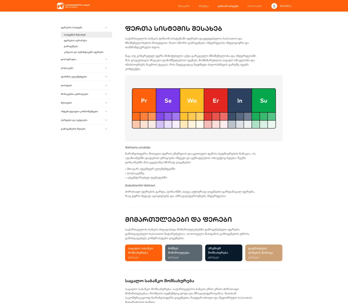
- Build design tokens first: colours, typography, spacing
- Establish contribution guidelines
- Plan a systematic rollout
The audit is the key
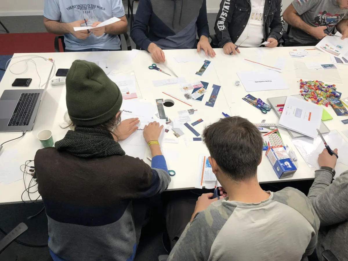
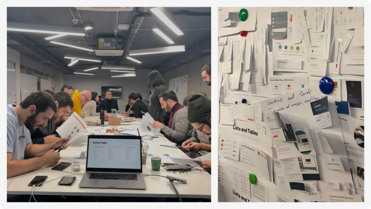
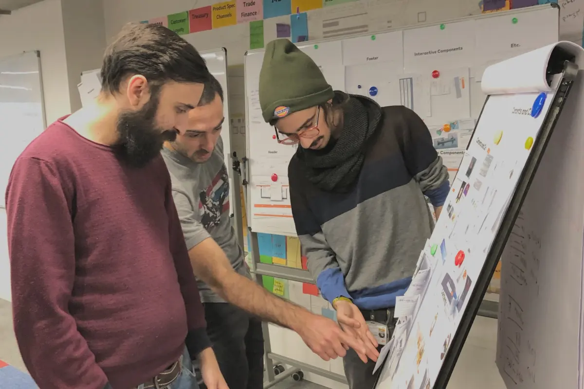
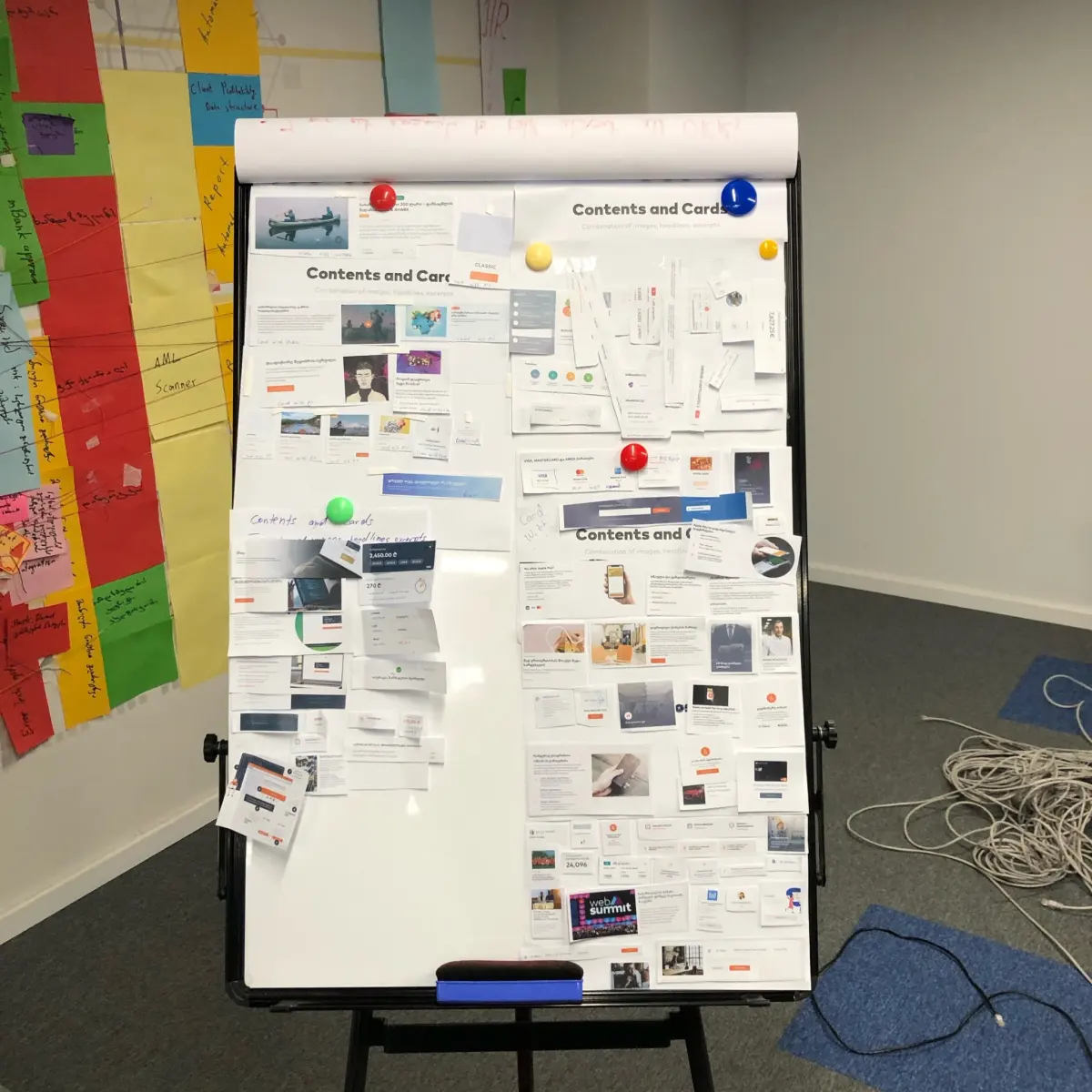
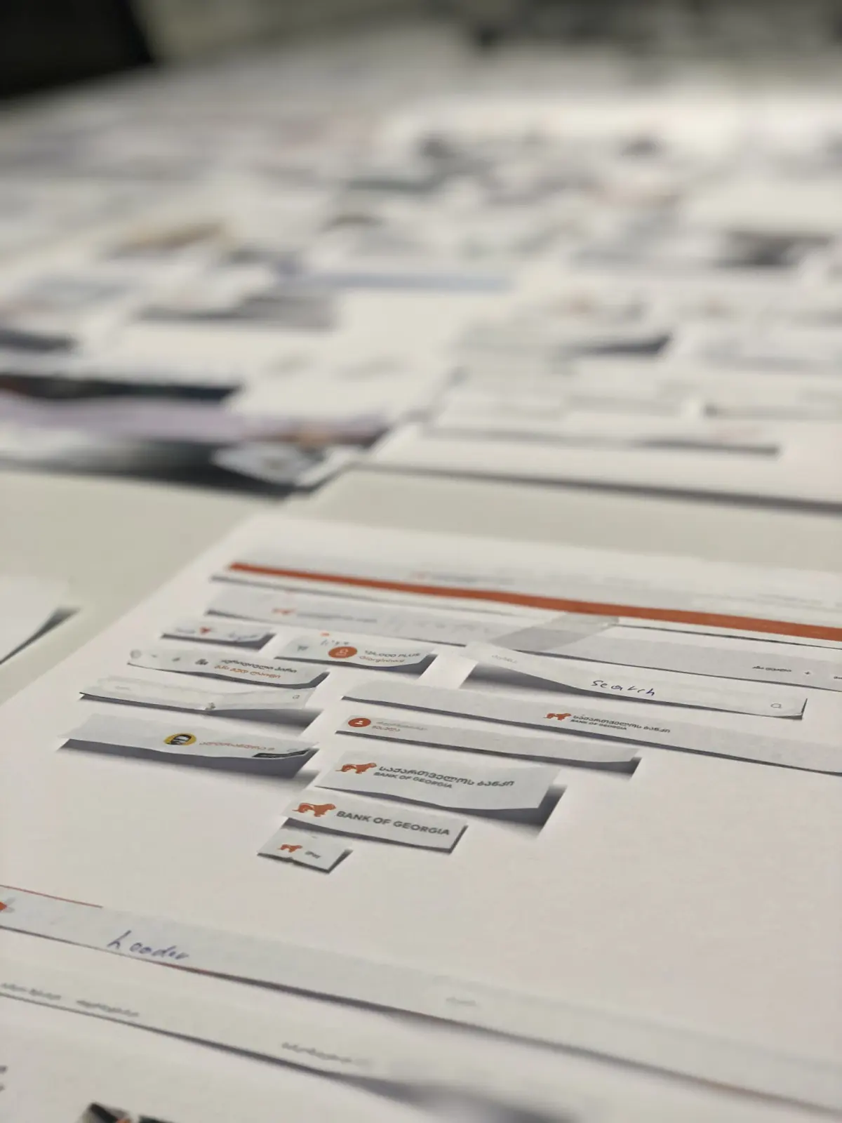
Since we were already creating products with existing designs, we discovered that we had a lot of identical and different design elements and components.
The Head of Design decided to run a workshop. All the cross-platform teams would bring the design elements and components they used in their products, and audit them.
Our plan was to merge visually and functionally identical elements together, and build components and organisms with states through our design system tokens.
Create a shared governance model
Design systems aren't just about pretty components. They're about people, processes and decisions.
After researching how other enterprise companies structured their design systems, we chose the federated model. Nathan Curtis's Team Models for Scaling a Design System was the reference.
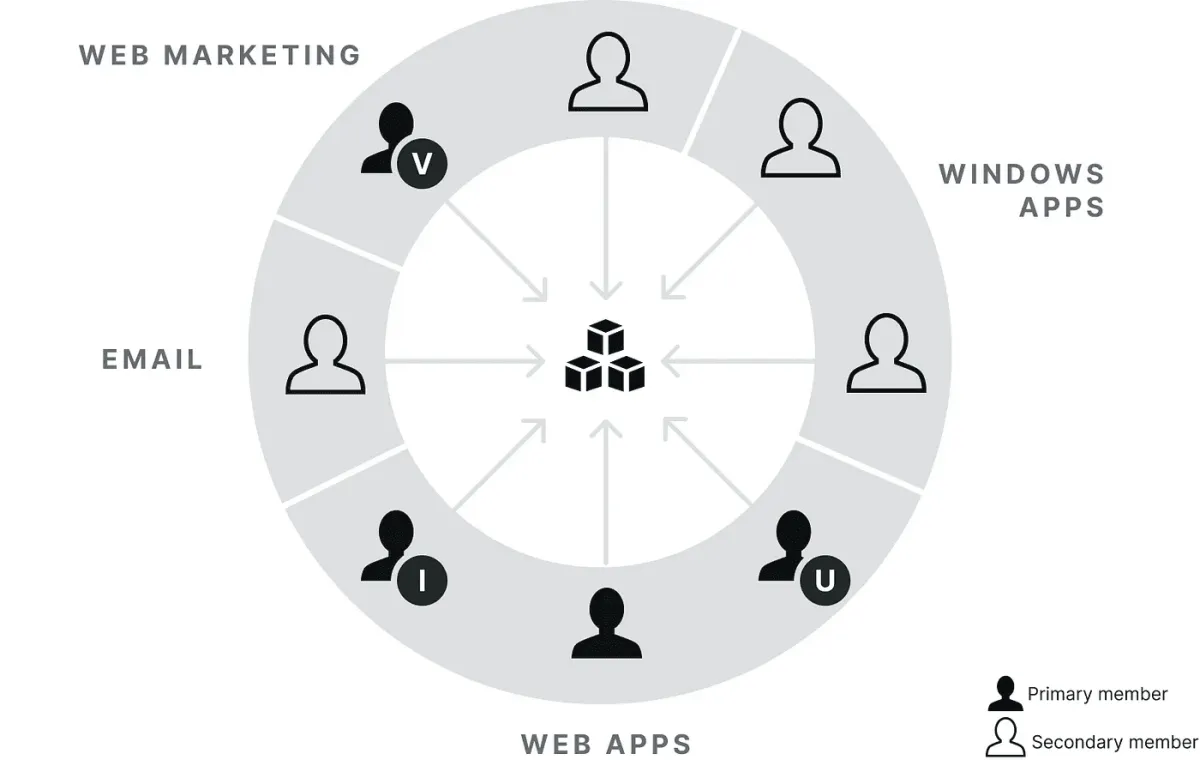
Our structure:
- A central design system team, the excellence team
- Product designers as system contributors
- A clear decision-making hierarchy
- Regular review cycles
- A contribution approval process
Everyone needed to know who owns what, how decisions get made, and how changes get approved. Without governance, design systems become chaos with better documentation.
Build design tokens first
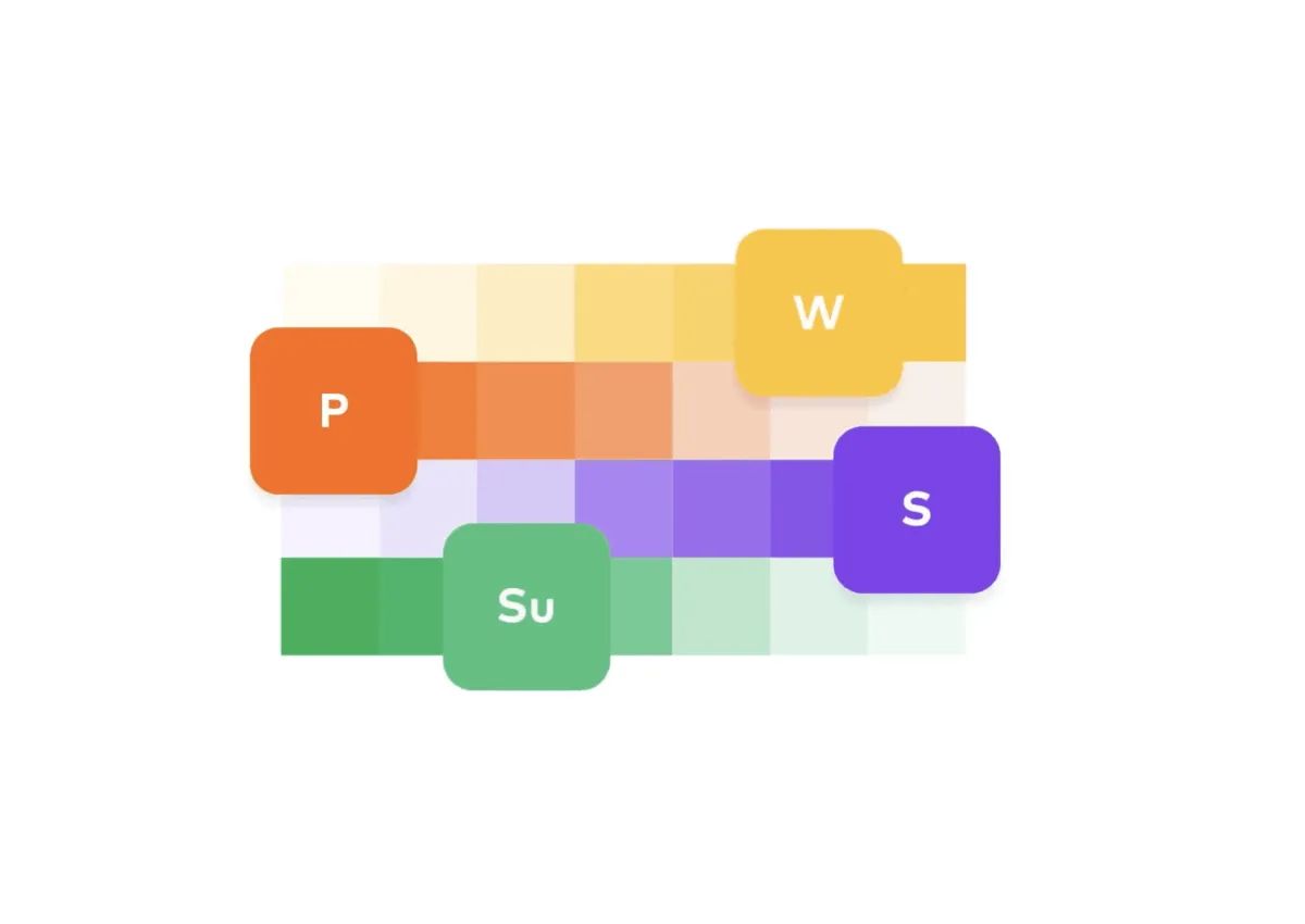
Tokens are the foundation of everything. If you start with components, you're building on quicksand.
We collaborated with our marketing department to establish design tokens that aligned with our brand guidelines.
This wasn't just about digital products. Everything had to work across digital and print touchpoints.
Our token categories:
- Colours
- Typography
- Spacing
- Icon system
- Layout and grids
- Shadows and elevations
- and more…
Tokens gave us the atomic-level consistency we needed. Every component built afterwards would inherit these foundational decisions.
Establish contribution guidelines
Thirty-plus teams need clear rules. We created a structured workflow that every contributor follows.
Each stage has specific deliverables and approval gates. No component enters the system without completing the full process.
That is what keeps quality steady when many teams contribute to one system.
- Backlog
- Design Research
- Wireframing
- Design Review
- Interface Design
- UX Motion
- Design Review
- Excellence Review
- Backlog
- Code Research
- Architectural Planning
- Code Review
- Front-End
- Review with Designer
- Excellence Review
- Storybook implementation
A public banking design system guideline
Once we had successfully contributed and established a stable version, we considered it necessary to share the story.
We had created one of the first large-scale design systems in the region, built with more than 650 internal contributors and implemented across many projects and products.
Building V1
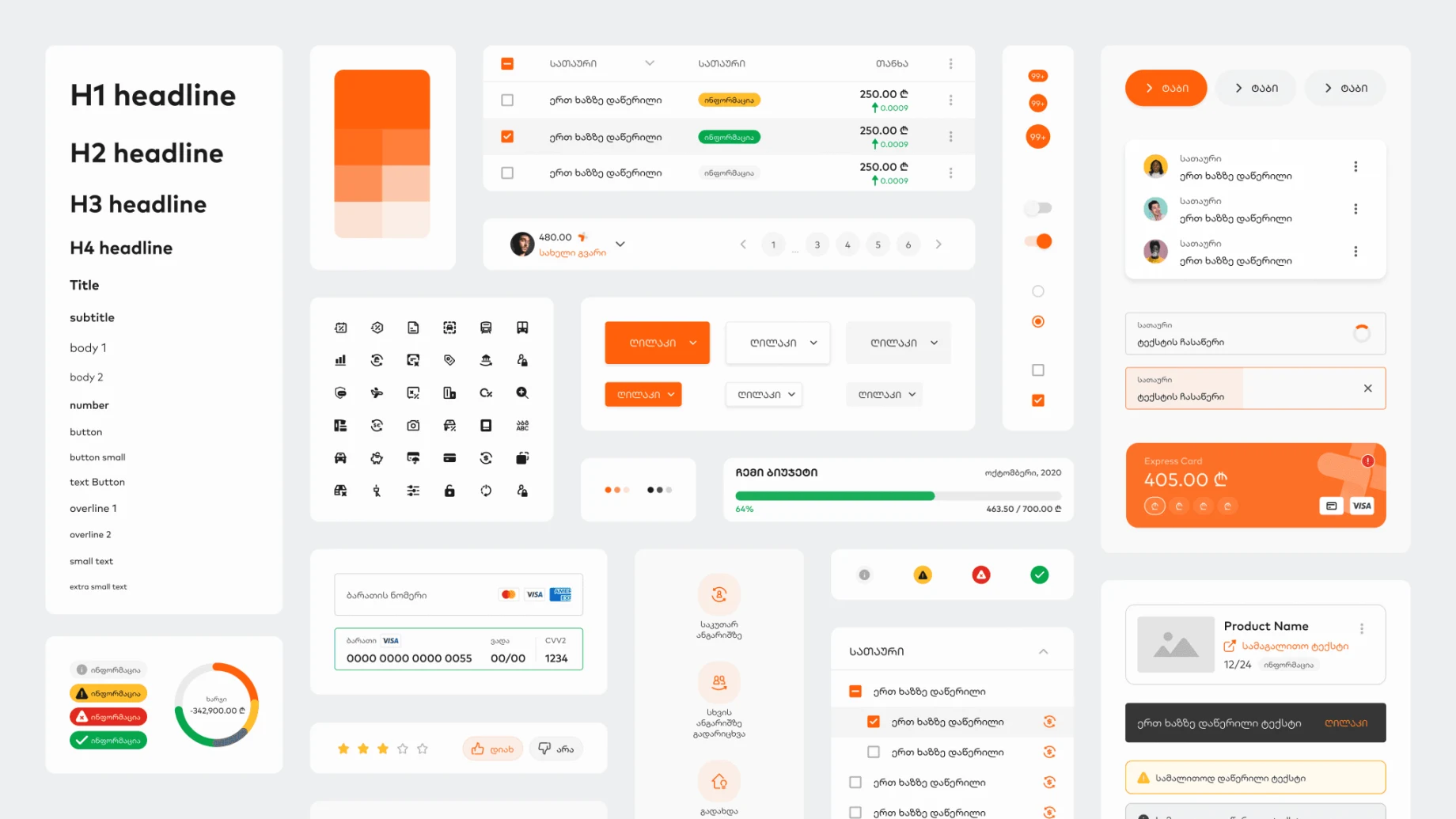
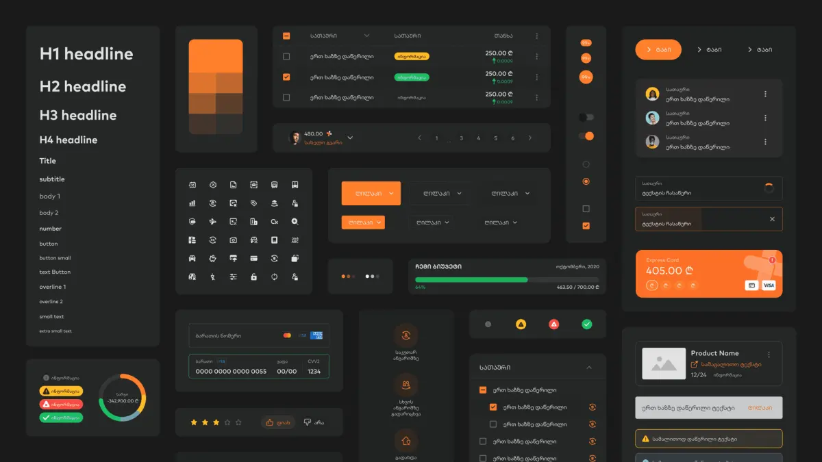
From the beginning we decided what to bring into the first version:
- Design tokens
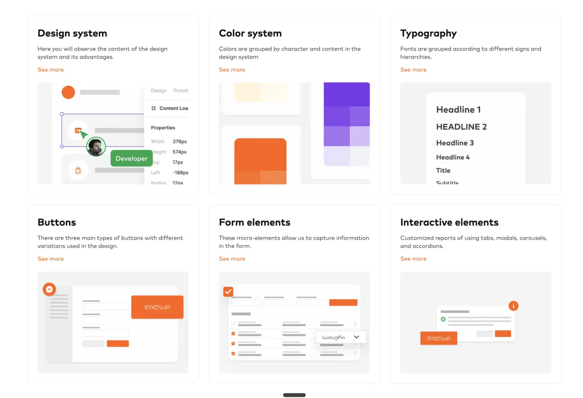
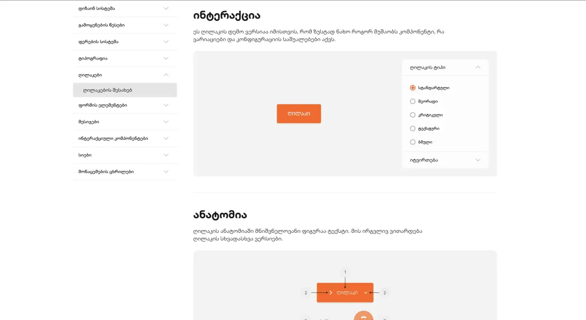
- Design elements: buttons, form elements, interactive elements, cards
- Multimedia assets
- Brand guideline
- UX writing guideline
But for a number of reasons, this version moved from the list of important priorities down to the lower-priority list.
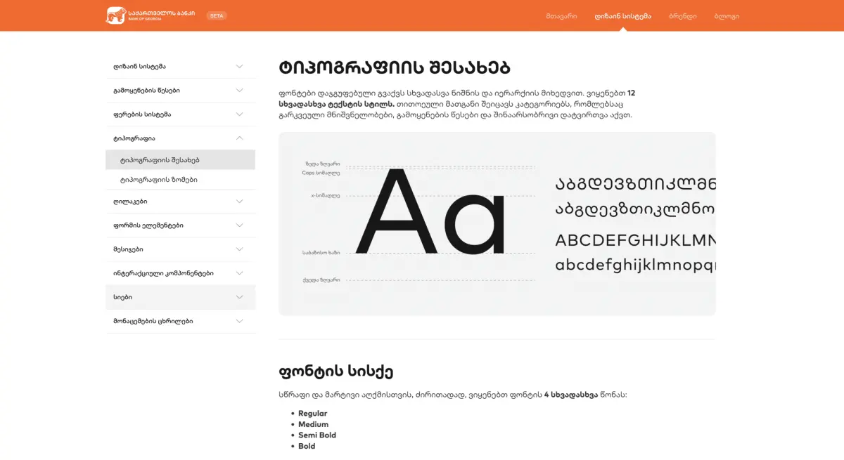
Once we started relaunching the platform we were given time to improve the navigation and documentation along with the visual elements.
The closest version
We started improving the UX and visual design along with the content. The goal was to show more value. We started talking to the marketing department, because we would need massive communication in our segment.
Launch
As I mentioned, the marketing team was actively involved. We asked them to create a video that explained the design system more easily to others.
I participated in the work on the video, both in creating the storytelling and in the art direction of the whole filming process.
Snippets
In the summary
- 400+ active elements in the design system
- ~500 digital products built on the same consistency
- 650+ internal team contributors
- Agile-friendly design processes and system
- A unique communication and design language
- ~500K engagement around the bog.design launch
and more, which converted into brand value, culture, and revenue.

Shoutout to the bog.design team and the rest of the digital teams who participated and contributed actively to the design system.