How I increased Pensight user activation 3×
- 3×
- user activation
- 60%
- activated, up from 20%
- 12.5%
- lower churn
- 3 months
- to get there
The short version
Users were signing up but struggling to complete profile setup. I redesigned the onboarding around a guided flow with a real-time preview.
Activation went from 20% to 60%, and churn dropped 12.5%.
Product and company context
Pensight is a creator platform that helps experts sell their knowledge through digital products, coaching sessions, courses and memberships.
For a creator to succeed they need to set up their profile and create their first offering. That is what we called activation.
The problem I found
As we added features to Pensight, our simple three-step signup stayed the same. People were completing registration but struggling to activate their profiles.
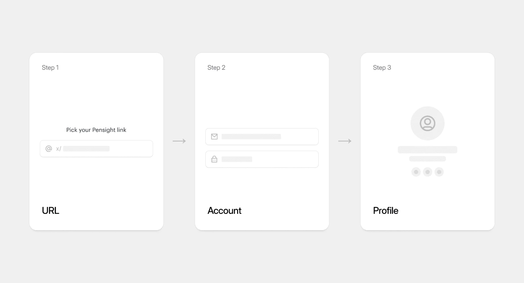
What my research revealed:
- Users signed up in two minutes
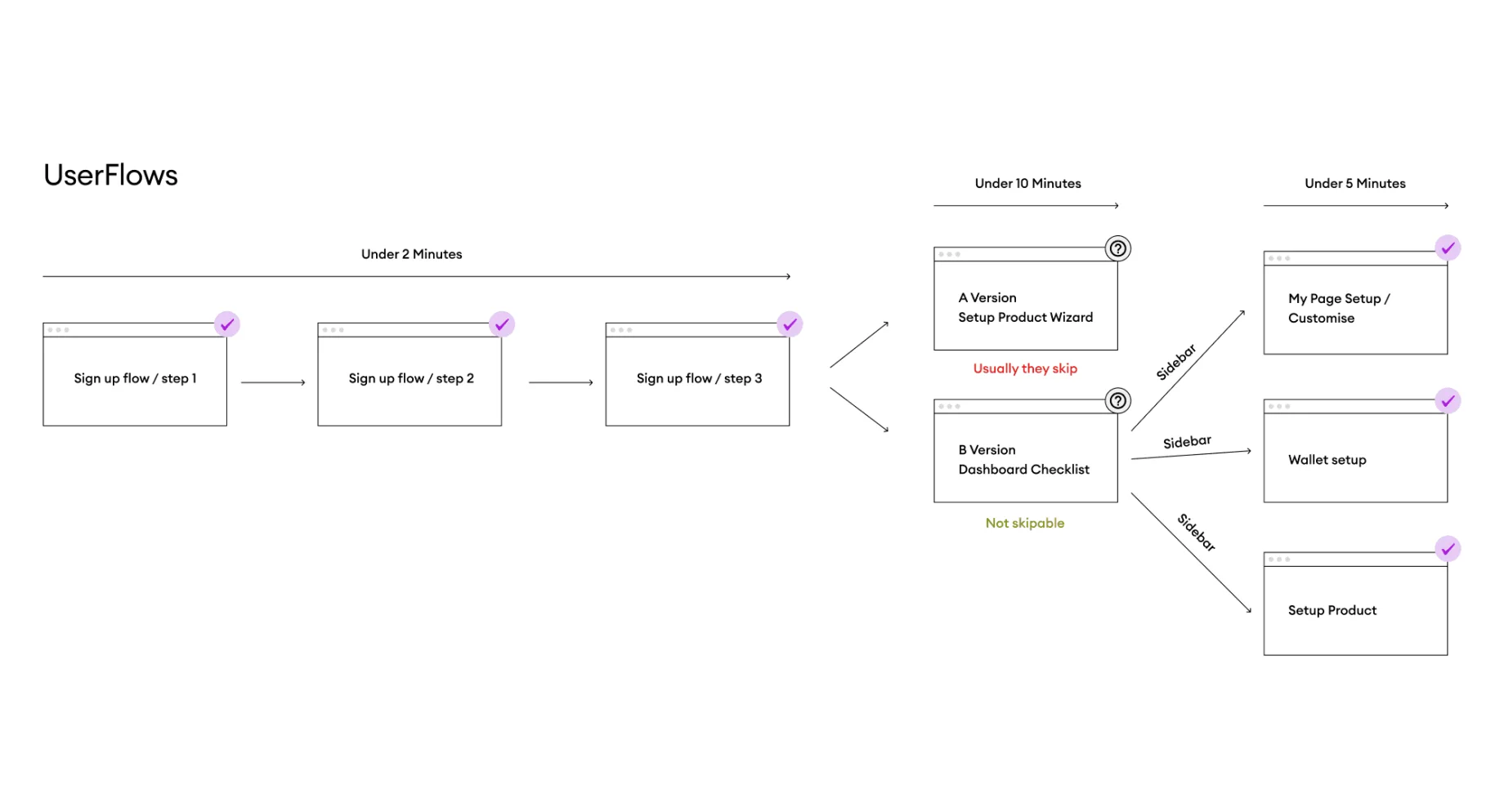
- They found paths to activation, but it took too long
- 80% were getting lost in the feature maze
- They wanted guidance, not more options
I realised we were optimising for signup, not success.
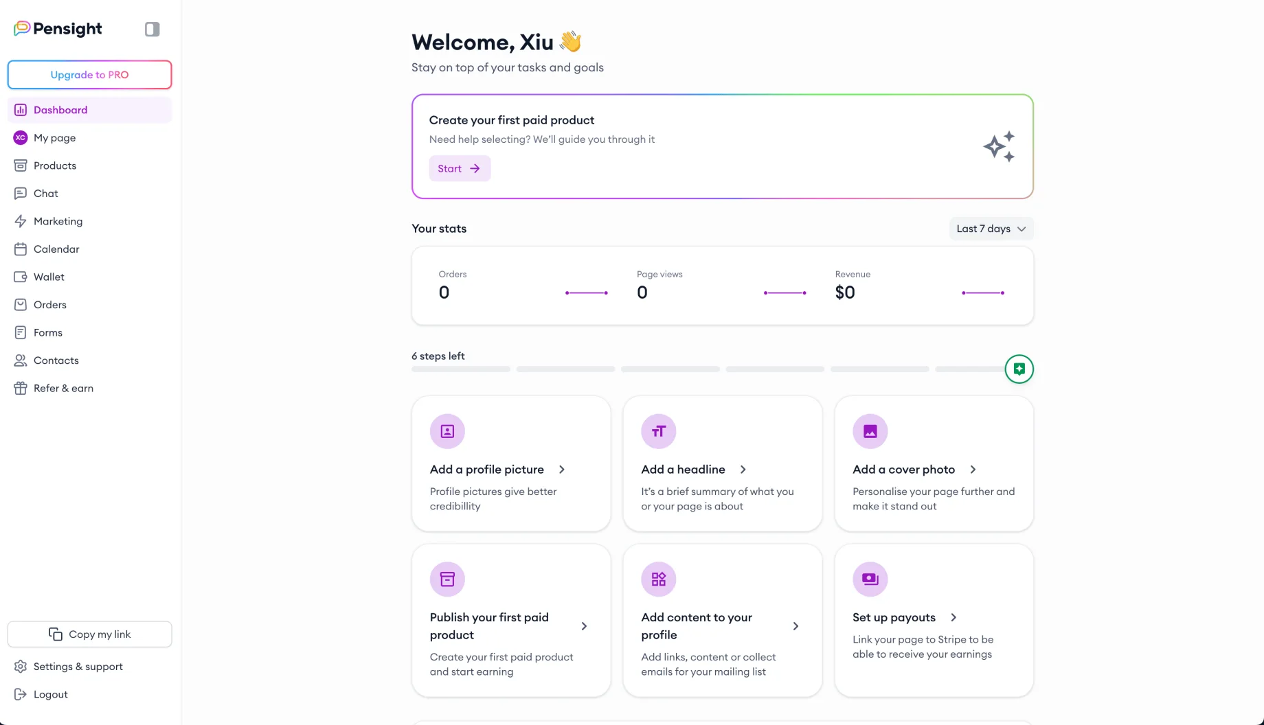
Why activation took so long
My research showed people taking many different routes to set up their profiles. Some succeeded. Most got overwhelmed along the way.
They were building workarounds and finding their own ways through, which told me the demand was there. We just needed to guide it.
The real pain points:
- Time investment
- “I don’t have time to figure this out”
- Money concerns
- “What if I set this up wrong?”
- No clear goal
- “I know I want to sell, but how?”
- Feature overwhelm
- “Too many options without guidance”
The solution: guided setup with live preview
Since people were finding their own paths but getting lost, I built a structured flow that takes them step by step.
The key move was real-time visual feedback. As you configure settings on the left, your profile builds live on the right.
The pattern came straight from our product creation wizard. Matching it kept the platform consistent, and made the learning curve easier for anyone who would go on to create a product.
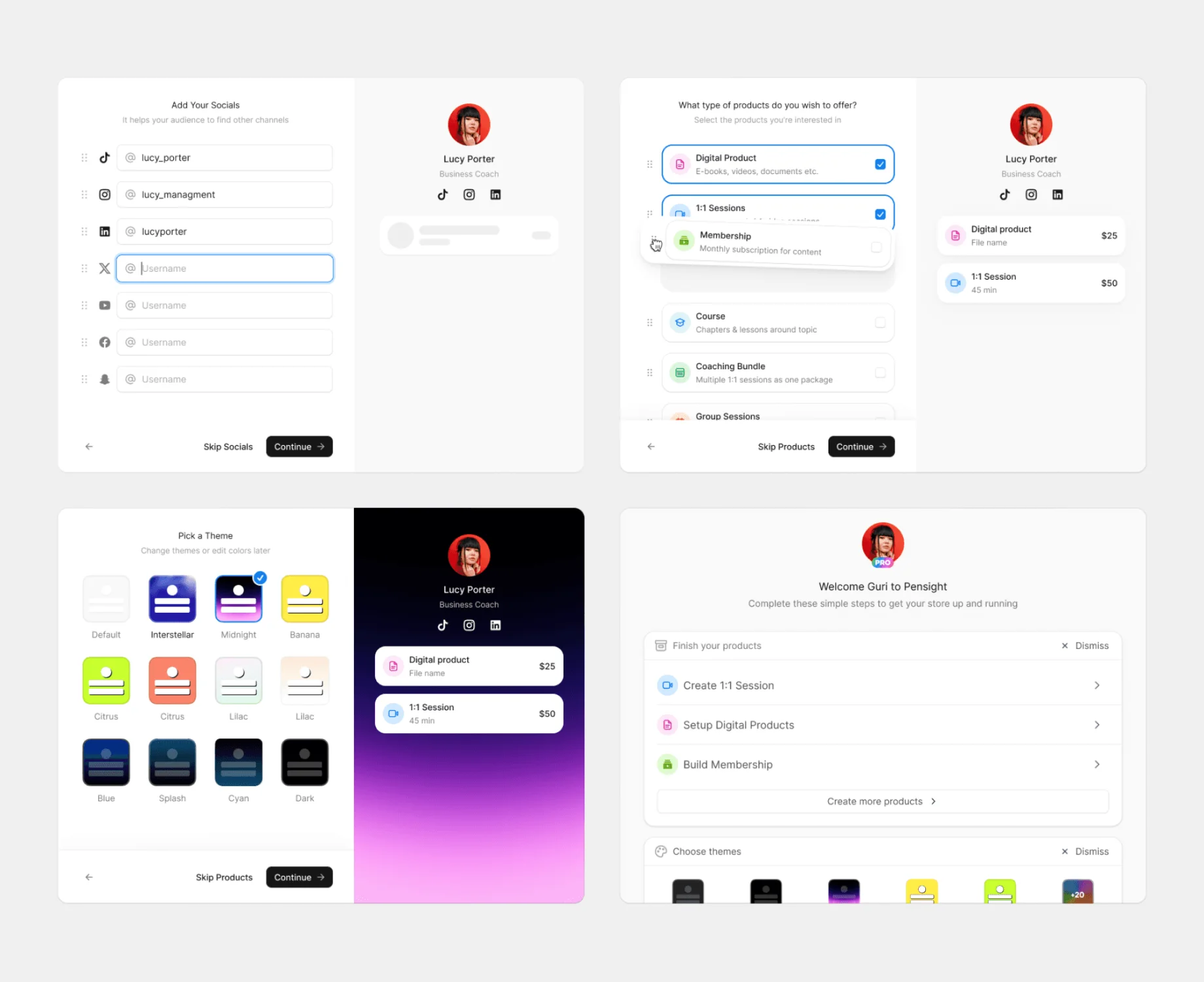
Why this approach:
- Reduces time investment: the important steps instead of open exploration
- Builds confidence: you see the result of each action immediately
- Shows progress: visual feedback keeps people moving
- Prevents mistakes: a guided flow reduces setup errors
- Pattern consistency: the same interactions as product creation
Instead of overwhelming people with options, they get a clear path and immediate visual validation, in patterns they already recognise.
Key design decisions
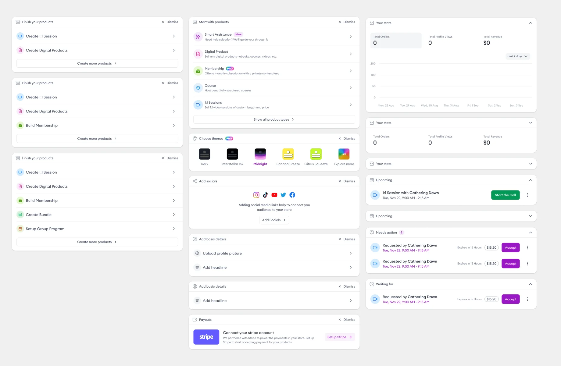
A fallback for skipped steps. Anyone who skips a step gets dashboard widgets as a second chance to activate. That way we do not lose the people who were not ready during setup.
Replaceable steps. The flow is built so steps can be swapped out against success data. If people start reaching activation another way, we can replace a step with a better one.
Premium investment reduces churn. People who customise a premium theme become invested in their setup. Churn fell 12.5%, because losing those customisations feels like a real loss. They stay subscribed to protect it.
Impact and results
- Activation jumped from 20% to 60% in the first three months
- Fewer users abandoning their profiles
- More people created their first product
- Increased Pro subscription rates
- Better retention
What I learned
- Show progress immediately
- the live preview kept people engaged instead of wondering whether it was working
- Guide choices, don’t overwhelm
- a clear path beats a full menu
- Make skipping safe
- power users need a way past the flow
- Tie value to retention
- when someone invests time in setup, they are more likely to stay